Toca Boca DatoCMS Manual
Table of content
- Toca Boca DatoCMS Manual
Intro
What is DatoCMS?
DatoCMS is a complete, user-friendly content management system that can be used by a wide range of teams including digital marketers, content editors, and developers. It’s easy to customize and extend based on unique business needs.
Why DatoCMS for Content Editors?
Besides being easy to get a hang of you will be able to edit content collaboratively with flexible layouts, without involving any IT-support.
Key Features for Editors
Preview changes in real time, scheduled publishing and full revision history are some of the key features that will provide your team with a smooth workflow.
Login
Read more
-
Logging into DatoCMS
Use your username and password to login on:
https://toca-boca.admin.datocms.com/ -
Navigating the CMS Interface
The first thing you will see when logged in is the dashboard. As the text in the middle of the screen says you can start by editing content in the side menu to the left.
The menu bar at the top of the screen has the “Content” section higlighted, meaning that is where you are currently working. Your profile picture in the top-right corner of the screen can be clicked. That is where you log out.
Working with records
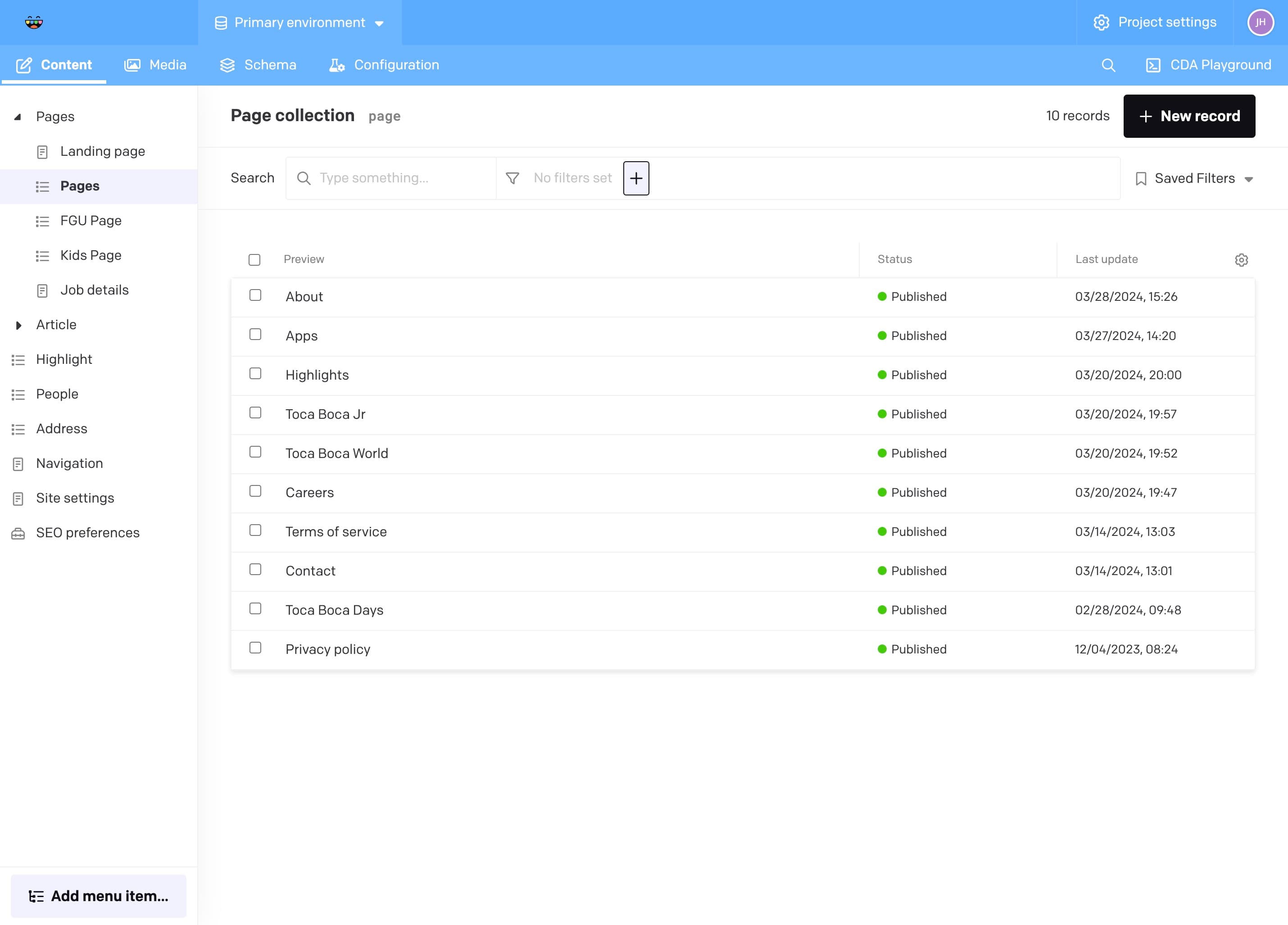
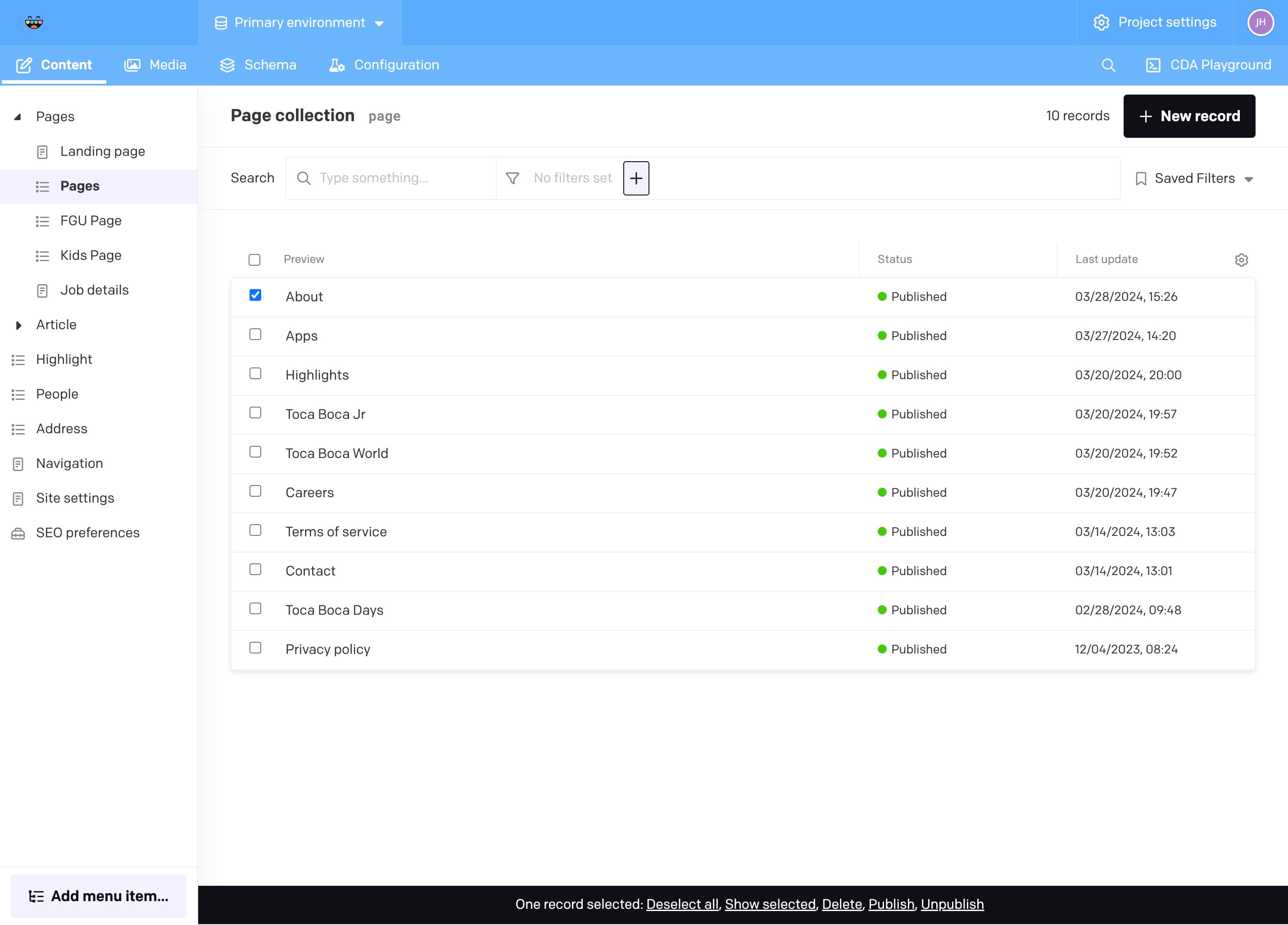
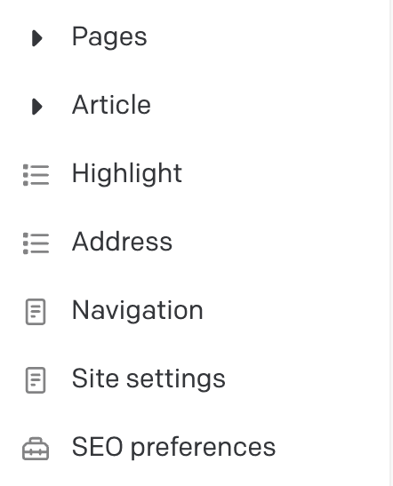
Resources are the dynamic content of the page. They are divided into several sections, such as Pages and Highlights.
High level concept
Dato consists of Records and Blocks that we use to build up the data structure for our website. These in turn contain fields that contain the actual data. Think of these as building blocks that build the website. Some blocks are containers for data, and can be linked to in other blocks. For example: An App block contains data about an app. But depending if it’s used in a Hero App block or an Image and Content block, it will render differently.
More info on specific blocks later.
General management
Below you will find a description of the general management of records. These are things that are common to all records.
Create a new record
Read more
Duplicate a record
Read more
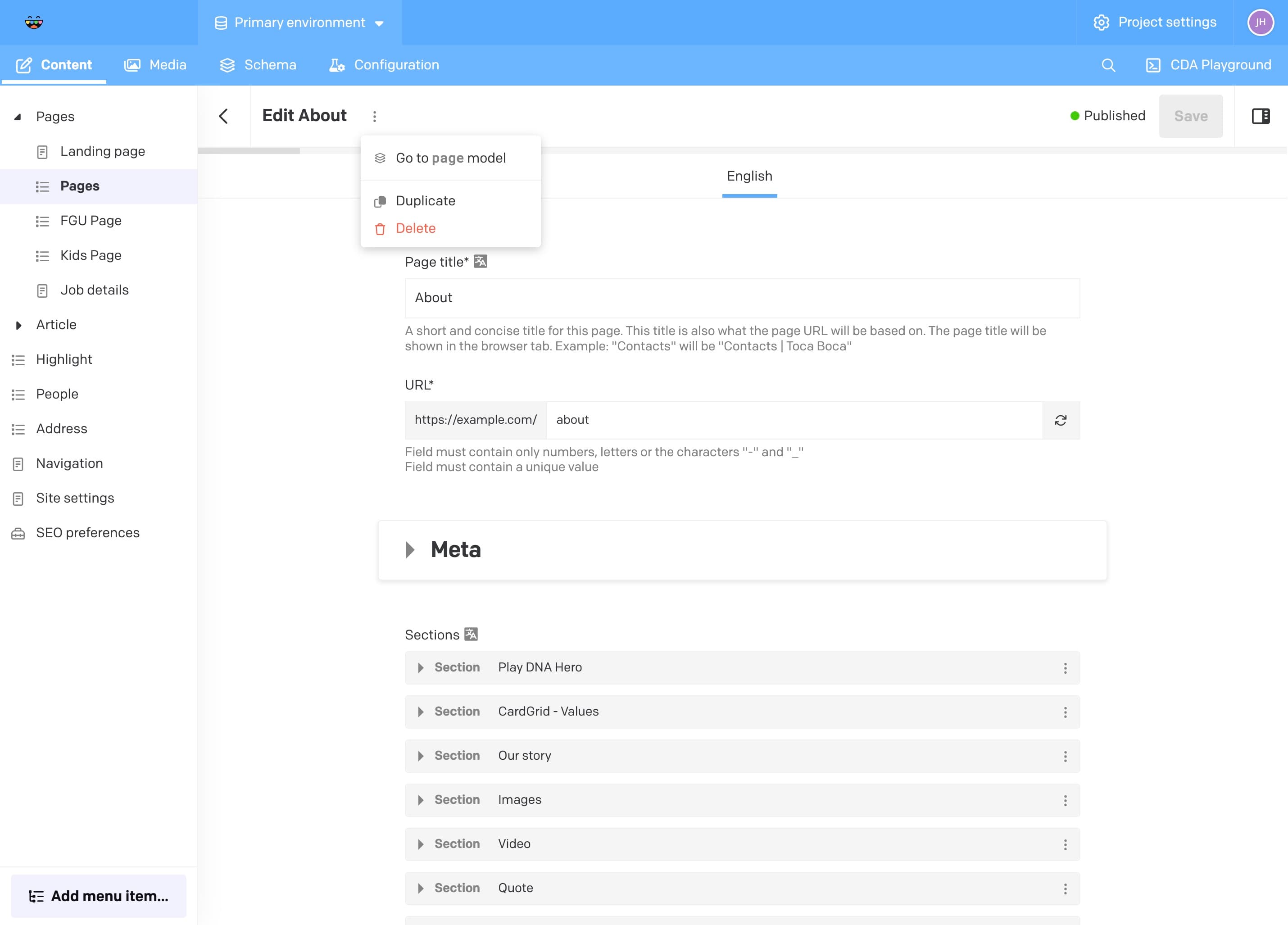
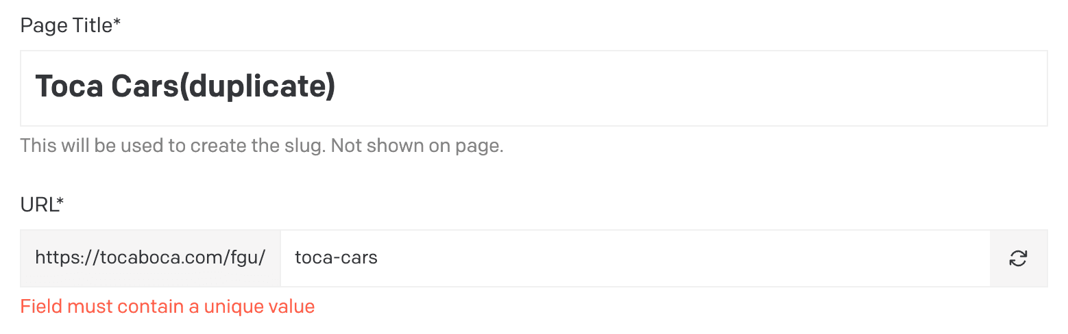
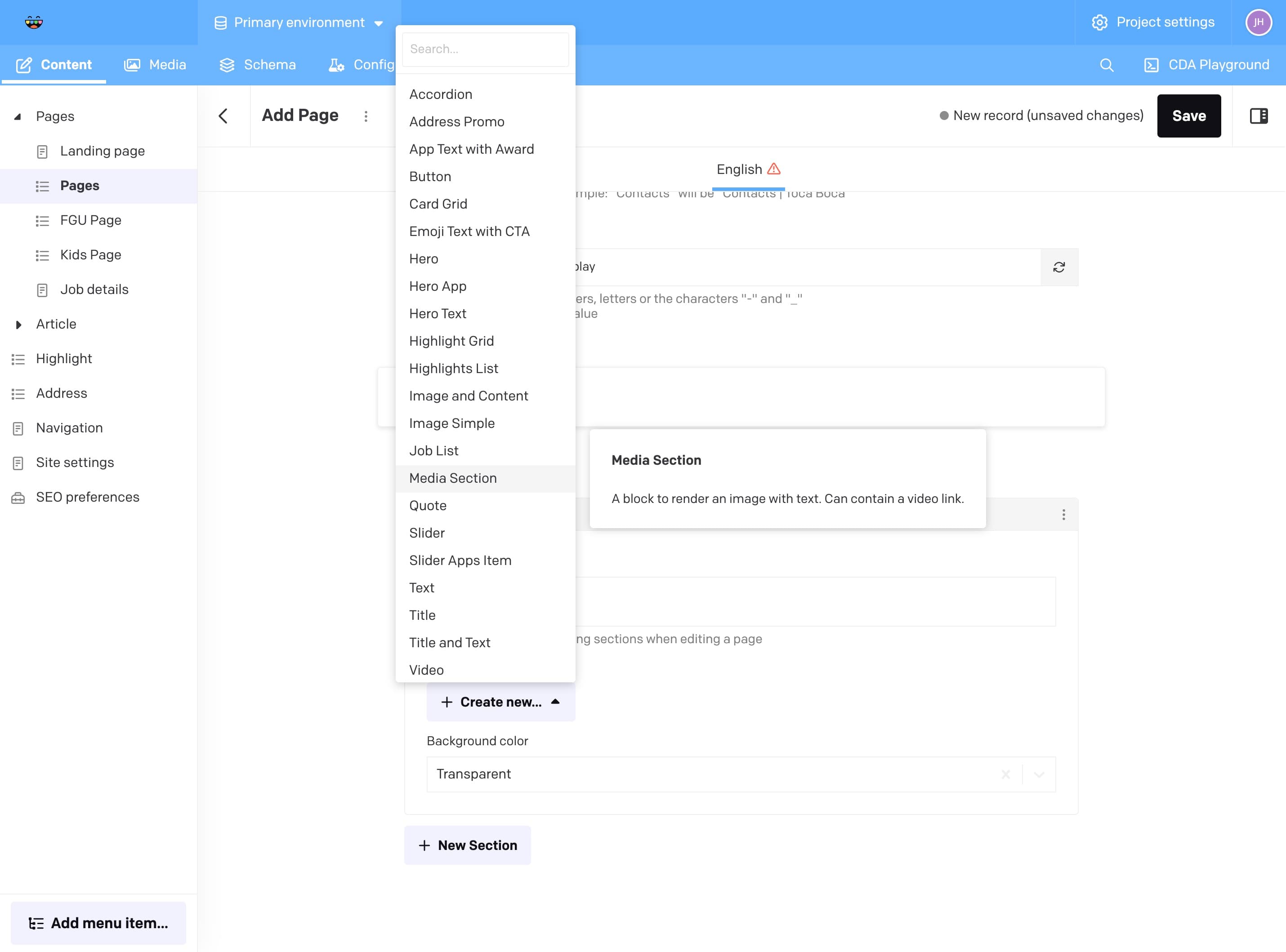
An efficient way of creating a new record is to duplicate a previous record. If you have an existing article with a similar format to the one you want to create this is a good way skip redoing alot of manual editing. In the image below, the edit view of a page is displayed. In this view it’s possible to click the vertical line of three dots next to “Edit #PAGE-NAME#” to reveal the option to duplicate.
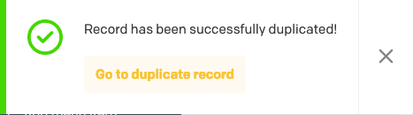
When clicked, a notification will appear in the bottom left corner. You can click “Go to duplicate record” to begin editing the new article right away.
Edit a record
Read more
To change a duplicated article to be valid you can begin by changing the “Internal title” to a unique value and clicking the “refresh” symbol to the right in the “URL Slug” field. The internal title will not be shown on the webpage except for in the URL. Press Save to save any editing made by you.
Delete and unpublish a record
Read more
To delete a record, either click the three vertical dots:
Or, back in the record collection, mark one or several records and click “Delete” in the banner appearing at the bottom of the page.
This is also the way of unpublishing on or several records. To unpublish a record while editing click the Unpublish button in the menu to the right. If this menu isn’t visible just click the panel icon to the right of the Save button to reveal it.
More on Pages
Articles are divided into three categories: Pages, FGU Pages and Kids Pages.
There are also two custom pages that contain details for specific pages; Landing Page and Job Details. These two specific pages are connected to more bespoke pages.
Setting meta data
- Meta
Here you can set the metadata for the specific page you are adding. Check the different tabs (Google/Twitter/Facebook) to see a preview on the data.
Building sections
- Sections
The Pages records have a block for adding Sections this is basically where you will build up the page. Each section contains a name; this can be linked to in our “Link” component (more on this later). They also contain a background color that can be set to one of the values from Toca Bocas palette. Each section should contain only one module. The module added decides what type of component will be rendered on the website.
Read more about building up your website.
Highlights
Read more
A highlight is the way we display news. These are interconnected with specific blocks that can be selected when building pages. A highlight can (and should often) be linked to an external site, where users can get more info.
Working with media
Uploading and managing images
Read more
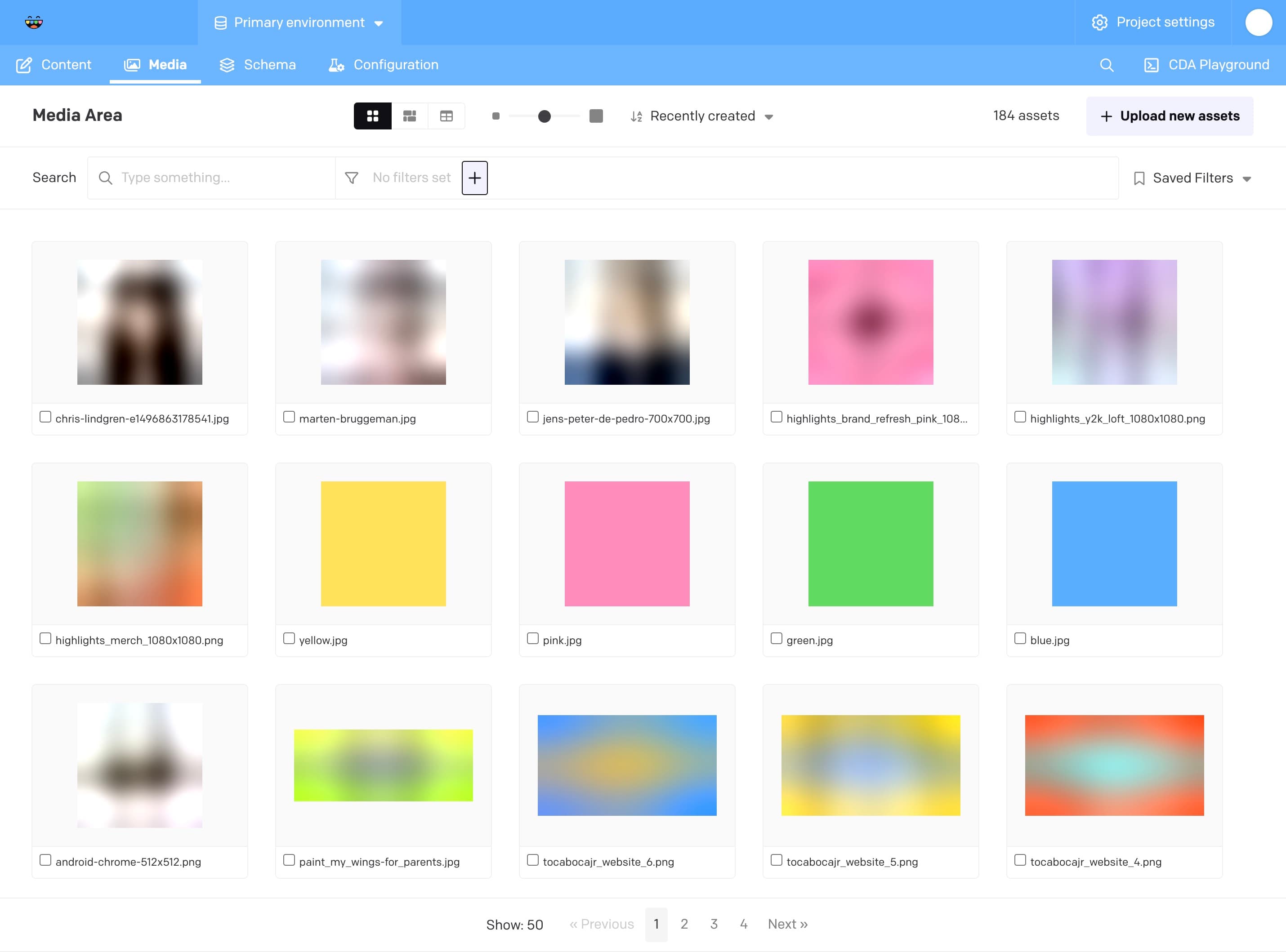
Uploading images can be done in either the media area:
Or while editing a specific record that can contain an image:
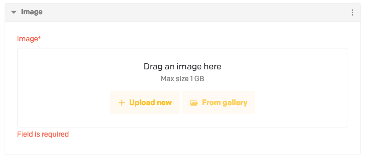
Image configuration
Read more
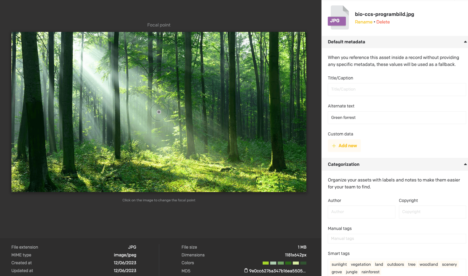
Images can be configured to specify a different focal point, a custom title, alternate text and tags.
- The focal point will decide what to crop of the width of the image cannot fit the container of the page. For example a smaller thumbnail of an employee will want to have the focal point in the center of the face.
- The title is mainly used for internal sorting while browsing the Media Area. It is required when uploading images.
- Alternate text is also required as it improves your page’s SEO in addition to making it more available to users utilizing screen readers.
- Tags are just there to help you sort among images of the Media Area and are entirely optional.
Videos
Read more
There are some components that can display a linked video. These videos are not supposed to be uploaded in the Media Assets library, but instead uses a link to a YouTube video.
Working with general content
To edit general content related to the navigation, visit the Navigation section in the left side menu under the Content tab.
Edit menu
Read more
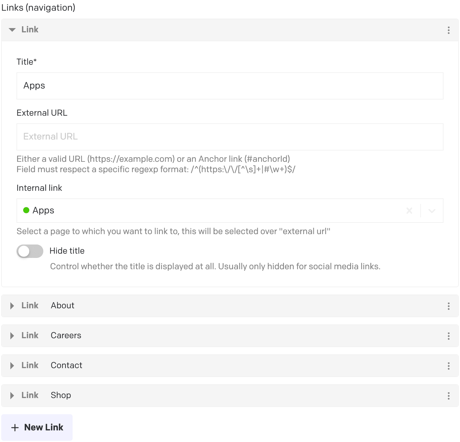
The “header menu” or “top navigation menu” can be customized to show links to pages from the website. It is very rarely needed to edit these as it greatly affects how the user interacts with the website. Each entry takes a title, which will be visible in the menu, and a link, preferably an internal link pointing to one of the pages of the website.
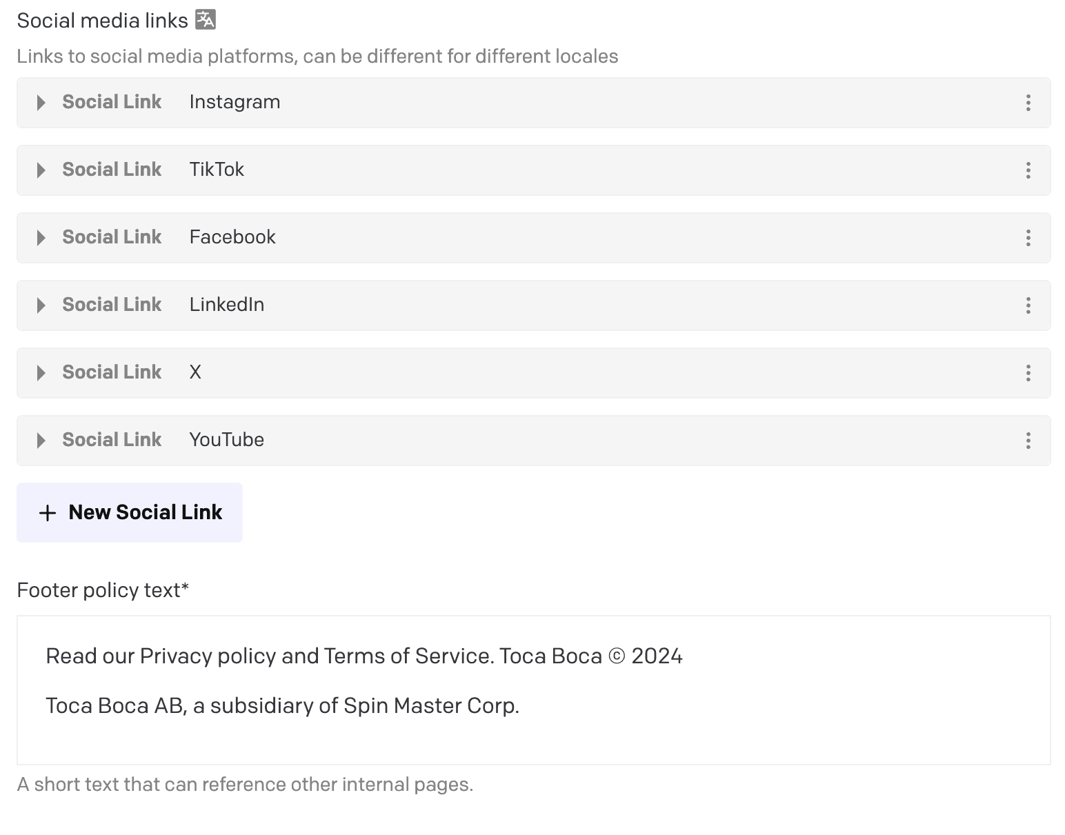
Edit footer
Read more
The footer menu works the same way as the header menu and will read the links from the navigation links. It also shows more specific links, such as social media links and footer policy text.
Working with page content
Building up the website from pages, sections, components and block is what it’s all about! Most blocks that are added contains fields. These fields should either be self explanatory, with good naming conventions, or will contain help text (grey text below field value) in case it’s needed.
Rich text content (Dato “Structured Text”)
Read more
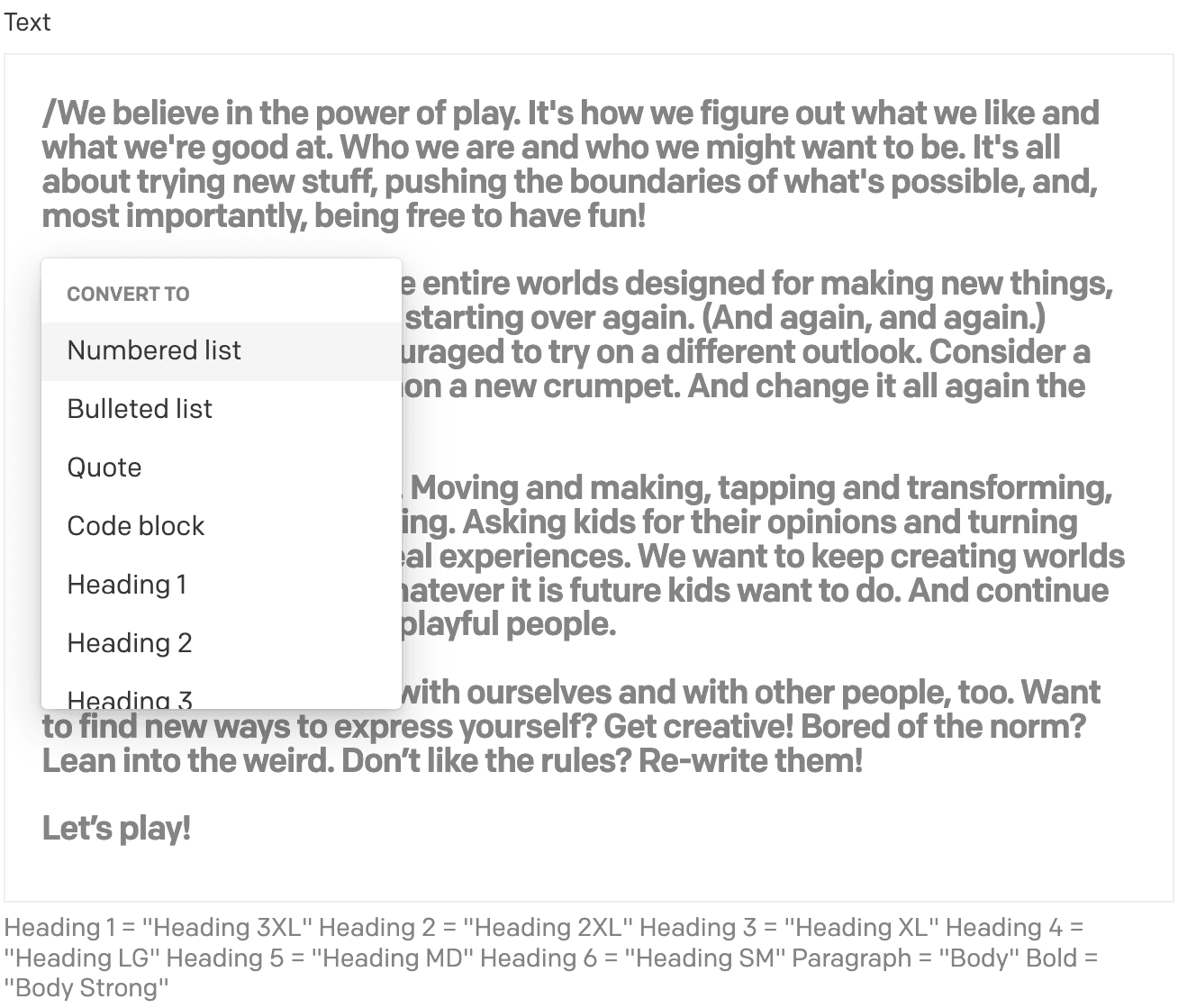
- Rich text can be formatted (unlike a single text field) by adding a ”/” at the start of each paragraph. Refer to the help text of the field to see which heading corresponds to a style on the website. In these text fields, you can also highlight the text you want to format and pick the format of choice. Example of formatting is cursive, bold, underline and link.
- Adding links
To add links, choose the word or sentence you want to be “clickable” by highlighting it and choosing the link symbol. You will be asked to provide the URL of the link and choose if it should open in a new window. It’s also possible to simply copy + paste a URL in the text and the text editor will recognize it as a link.

Flexible content (“sections” with “modules”)
Read more
Flexible content is a way of creating content in different places on the website. It is divided into sections and modules. A section is a container for one or several modules. A module is a container for content such as text, images, videos and more. The easiest way to create a new section is to duplicate an existing one and edit the modules within it.
An example workflow for adding a new module to a section:
- Go to “Pages”
- Open any page by clicking on it in the list
- Scroll down to “Sections”
- Expand the section you want to add a module to
- Click “Create new”
- Select the type of module you want to add
Publishing and unpublishing
Read more
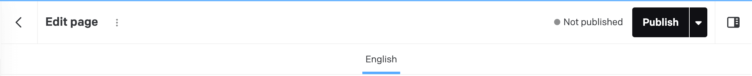
Publishing
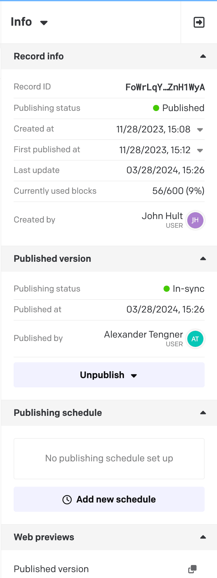
When you’re done editing a record and have saved your changes you will be given to option to publish:
Unpublishing
See Delete and unpublish a record
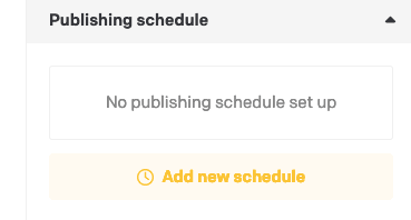
Scheduled publishing and unpublishing
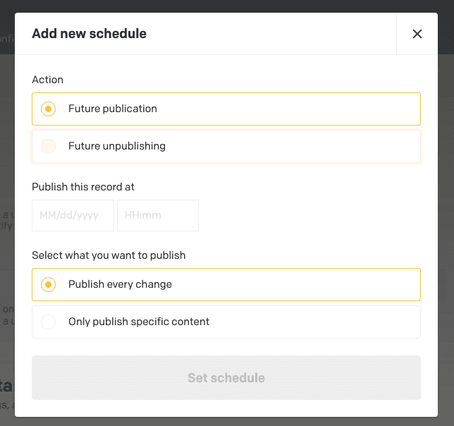
To publish a record such as an article by a schedule click the “Add new schedule” button.
Choose the action of your choice, “Future publication” or “Future unpublishing”. Choose which date and time and what content to publish or unpublish.
Specific components
Below follows a bit of information about some of the systems/components we’ve built that might be a bit complex to grasp at first glance.
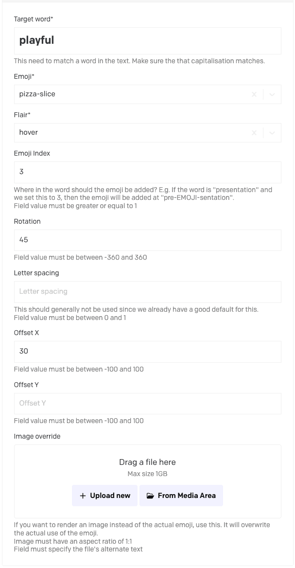
Emoji Text
A header that contains an emoji somewhere in the text.

Read more
There are some things to consider when using an Emoji Text.
- It can be used without an emoji and will just function as a normal header.
An Emoji Text will consist of one or more Emojis in Text (yes, not the best naming convention, but this is where we ended up). Most fields should be self explanatory, but below follows some extra info. Also, refer to the help text on each field in Dato.
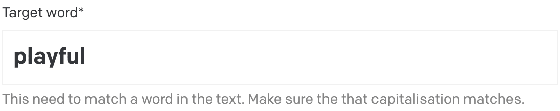
- The target word is case sensitive.
- Most fields that are not mandatory should have a good default and can be left blank.
- Flair decided between: static (shown at all times), hover (shown on hover), and animated (uses a preset animation).
- If Emoji Index is not added, we will default to middle of the word.
- Offset is based on percent; so 100 in offset x means it will move right one full length of itself.
- Image override gives you the ability to add any PNG as an emoji instead. You still need to select an Emoji, but since it gets overwritten, it doesn’t really matter which one is selected.
Attach Gesture
A wrapper around specific objects that adds a gesture to specific components.

Read more
At some places, in some blocks, you will be able to add an Attach Gesture block. Use the controls presented in Dato to set the position to your liking. Remember to check multiple screen sizes and make sure it works across all devices. There are some fixes that gets applied to smaller screens, such as lowering the line thickness, but very much will be controlled by you as an editor.
The gesture in itself should be dynamic and resize to different screen sizes. However, working with a living and dynamic webpage, content placement can differ across different screen sizes, thus, have an impact on how the gesture gets rendered.
Some details:
- The Outside field on this block will decide if it gets rendered on the point of the bounding box, or align to the corner, see image below.

Image Composition
An image composition that uses a background image and one or more foreground images.
Read more
This is a block that is made to build a composition where foreground images can extend outside of the main background image.
This component uses an array of Image Composition Foreground Props (puh, that’s a mouthful) group to set the properties of the images. The first image will correspond to the first item in this group.